So we recently wrote a piece on the Top 10 Data Visualization Experts you should be following on Twitter, which you can find here if you’re wondering. To follow up on that we decided that we would enlighten you with our Top 5 data visualization TED Talks. The five talks below are all very different but all have one thing in common, they are all extremely thought-provoking and allow you to look at data in an entirely different and alternative way. So with that being said, here’s our 5 must see data visualization TED Talks, enjoy!
Hans Rosling
One thing is guaranteed, you will most likely not see a TED talk that has such a high level of insightfulness combined with humor and urgency than the one here from Hans Rosling. His passion for data and looking at data from different perspectives is something that has never been seen before. It has been said that his talks have the “drama and urgency of a sportscaster” which is not something you would often associate with a professor of global health. With that being said his TED Talk on debunking the myths of the so-called developing world is a must watch.
David McCandless
David McCandless’s entire philosophy revolves around making information and data beautiful. Throughout this intriguing talk he turns large, complex data sets like worldwide military spending, media data and Facebook relationship status’s into engaging simple visualizations that allow the viewer to tease out patterns and trends and make connections between the data. He admits that he only recently began designing himself but his emphasis on design shows us how important it is when creating beautiful visualizations.
Aaron Koblin
Artist Aaron Koblin is widely known for taking vast amounts of data and often times taking vast amounts of people and transforming them into fascinating visualizations. Within this talk he demonstrates visualizations ranging from the tracing of airline flights across the United States to cell phone usage in large cities. His combination of artistic flair and hard hitting data often makes for an intriguing outcome and that is vividly seen throughout this talk as he showcases some of his finest work.
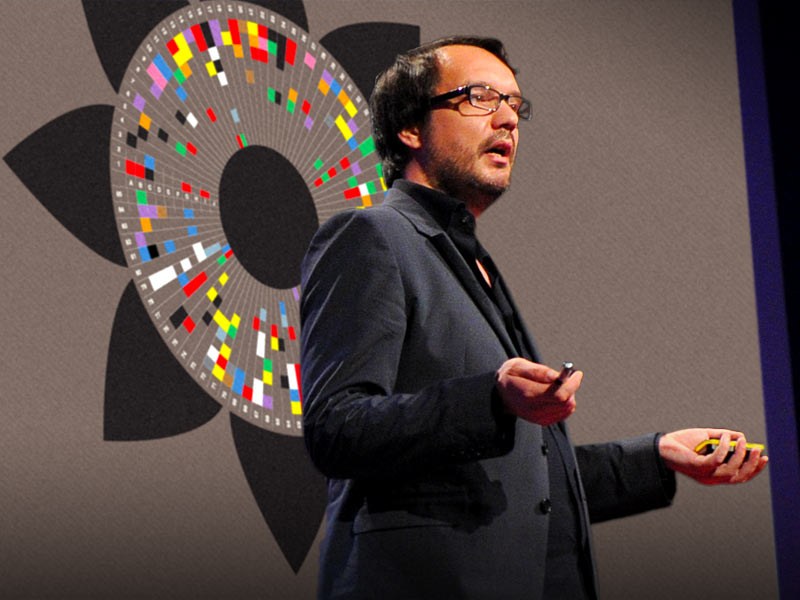
Jer Thorpe
Jer Thorpe’s talk on how we can utilize data really puts into perspective how valuable human context is in order to have a relatable understanding of the data we look at. Too often people look at data as being abstract information as opposed to a bank of invaluable knowledge that can provide outstanding insights and change the way we look at things. In this talk Jer shares his moving projects from graphing and entire year’s news cycle, to mapping the way people share content across the internet. A real thought provoking message through-out.
Chris Johnson
Chris Johnson, who is the Director of scientific computing and the imaging institute at the University of Utah discusses the breakthroughs in creating digital visualizations of large data sets. Throughout the talk Johnson breaks down the actual size of data and delves into the amount of data we are now creating. We now create more data in two days that we did from the beginning of civilization up to 2003. Some astonishing statistics throughout and a must watch if you want to truly get your head around how much data we now accumulate and the ways we can visualize it.
We can often get bogged down with the traditional ways to visualize our data that we frequently forget to allow ourselves to think outside the box and realize that looking at data in abstract ways can often highlight different and often times vital information. We hope you picked up data viz tricks to add to your arsenal.